Sans Serif
Neo Grotesque
Credits & details
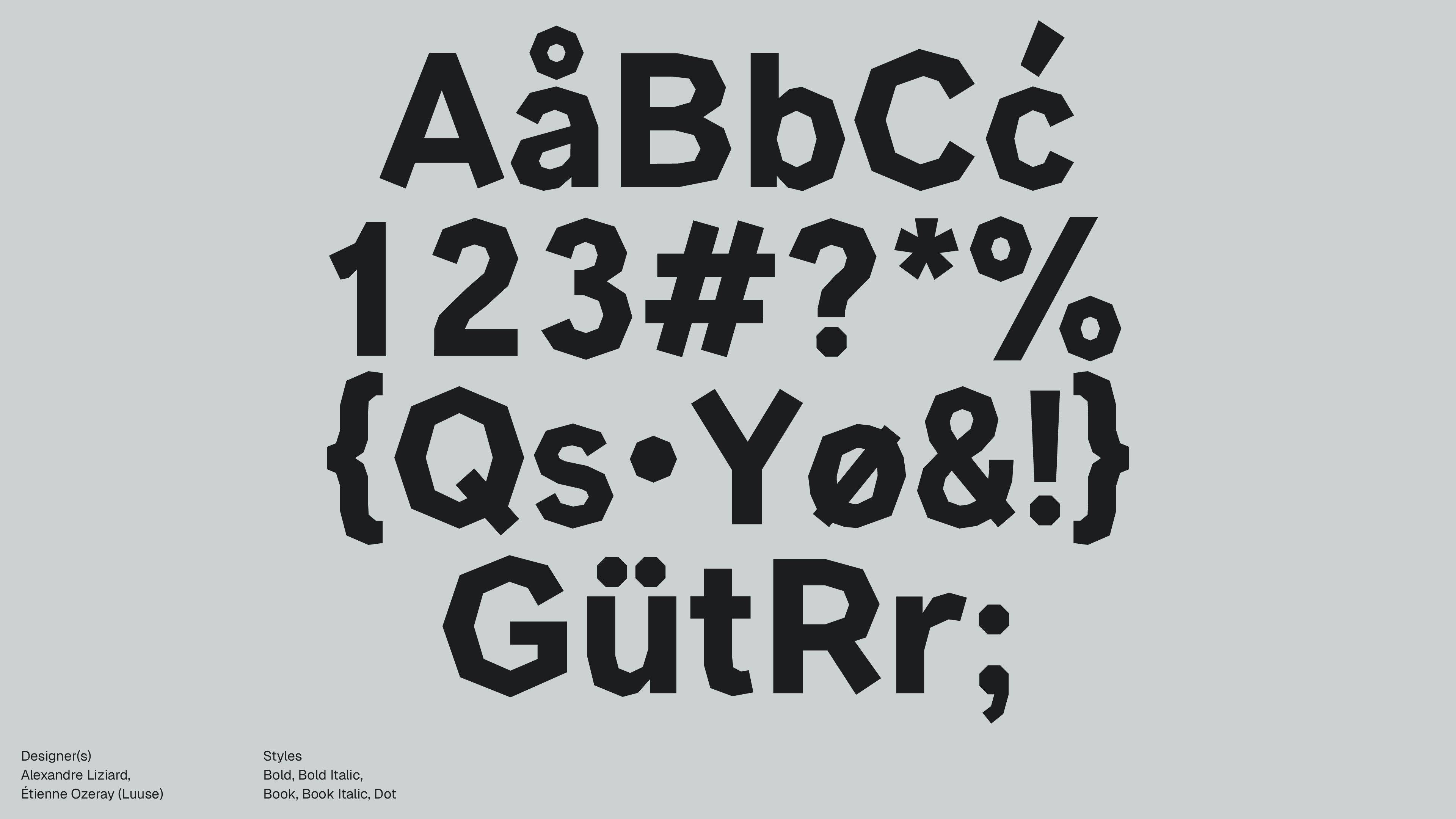
Designer(s)
Mathieu Triay
FOUNDRY
Atelier Triay
Styles
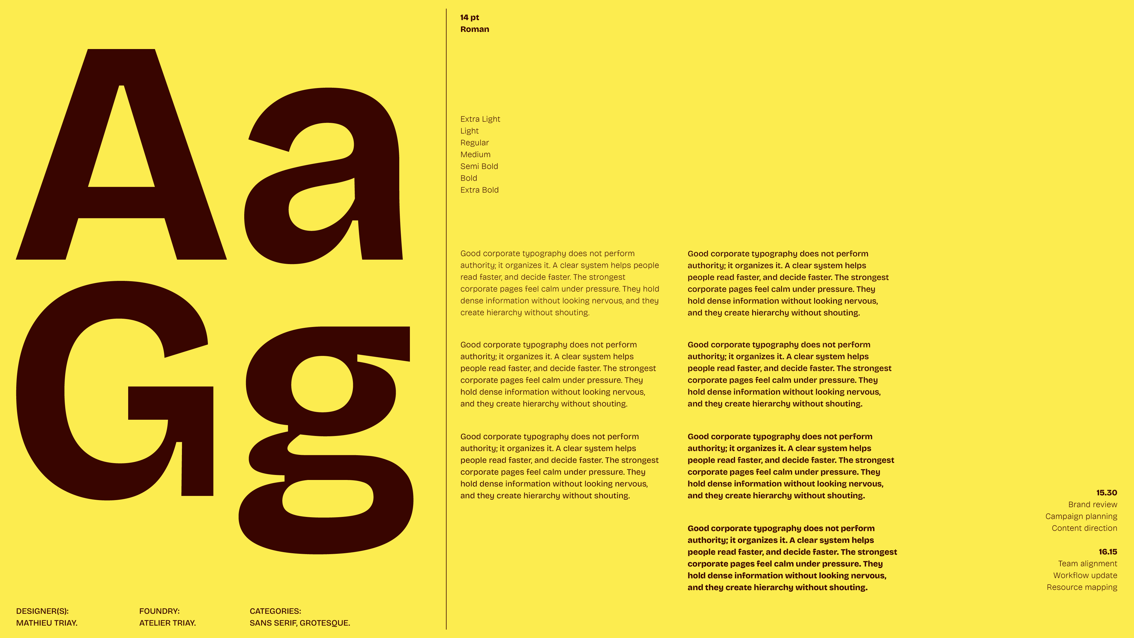
Extra Light, Light, Regular, Medium, Semi Bold, Bold, Extra Bold. Variable font (Weight, Width, Optical Size)
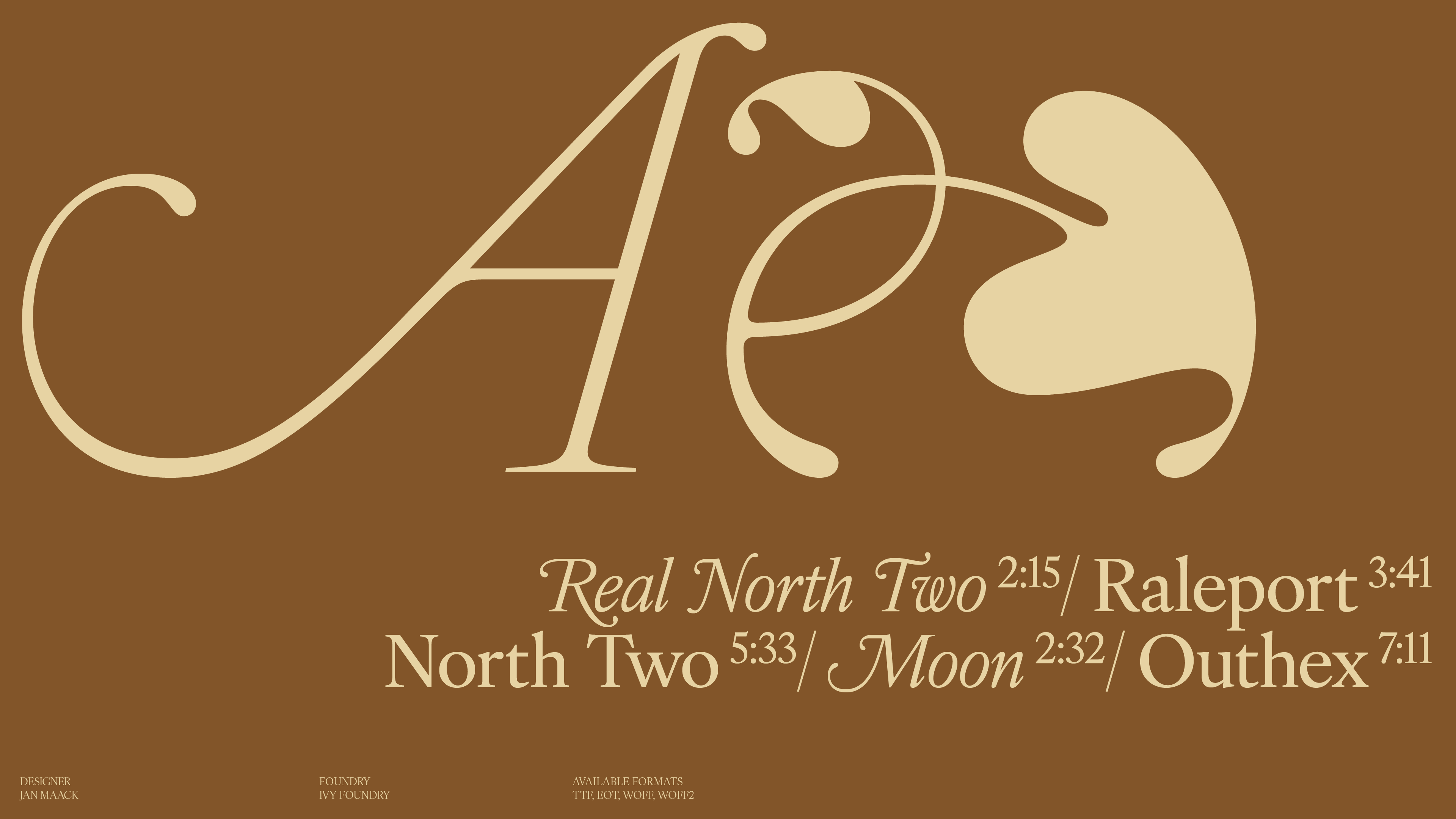
Designed
2022
author
Ale Mottesi
Date
Share
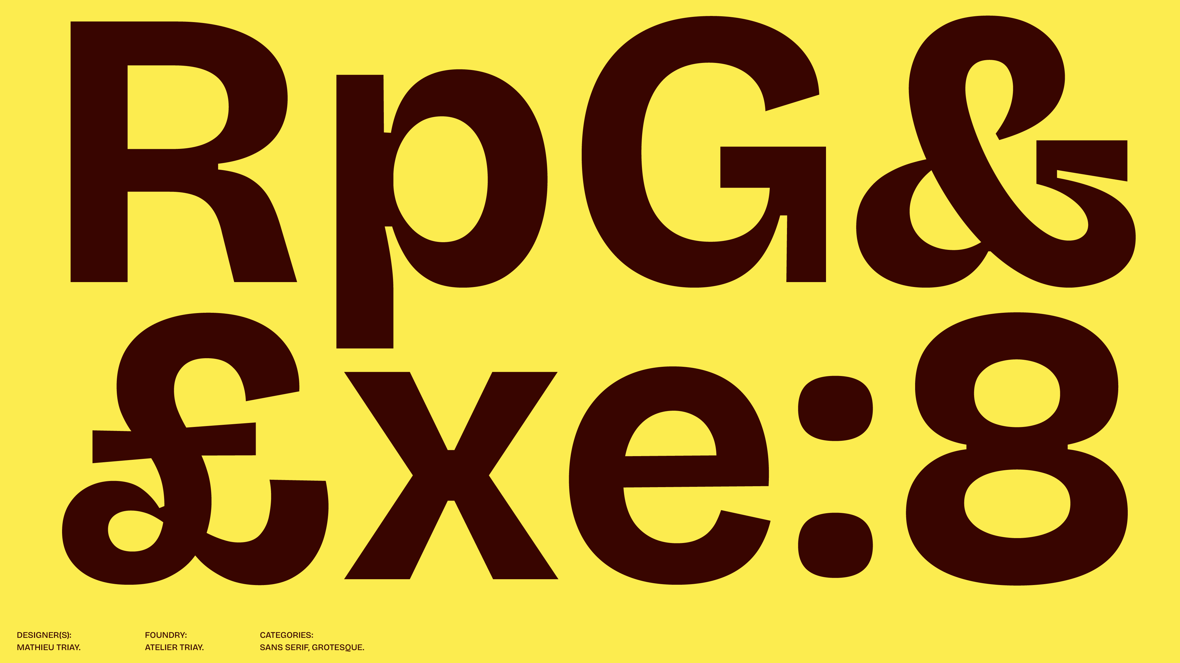
Bricolage Grotesque looks modern and works well across different uses, but it has a visible personality. Some of its letters feel tighter and heavier than in a typical clean sans-serif, and that gives the typeface a recognizable character. It was not designed from scratch, but began with an existing open-source font, Mayenne Sans by Jérémy Landes, and was reshaped from there.
Designed by Mathieu Triay of Atelier Triay, it is available through Google Fonts as a variable font. Rather than fixed styles, it moves across three axes: weight, width, and optical size. The shapes become tighter and more detailed at large sizes, and more open and readable at small ones. Where most contemporary sans-serifs smooth everything out, Bricolage keeps its letters compact: the interior spaces in letters like o, p, a, and e are smaller than usual, which gives the typeface a denser, more present feel.
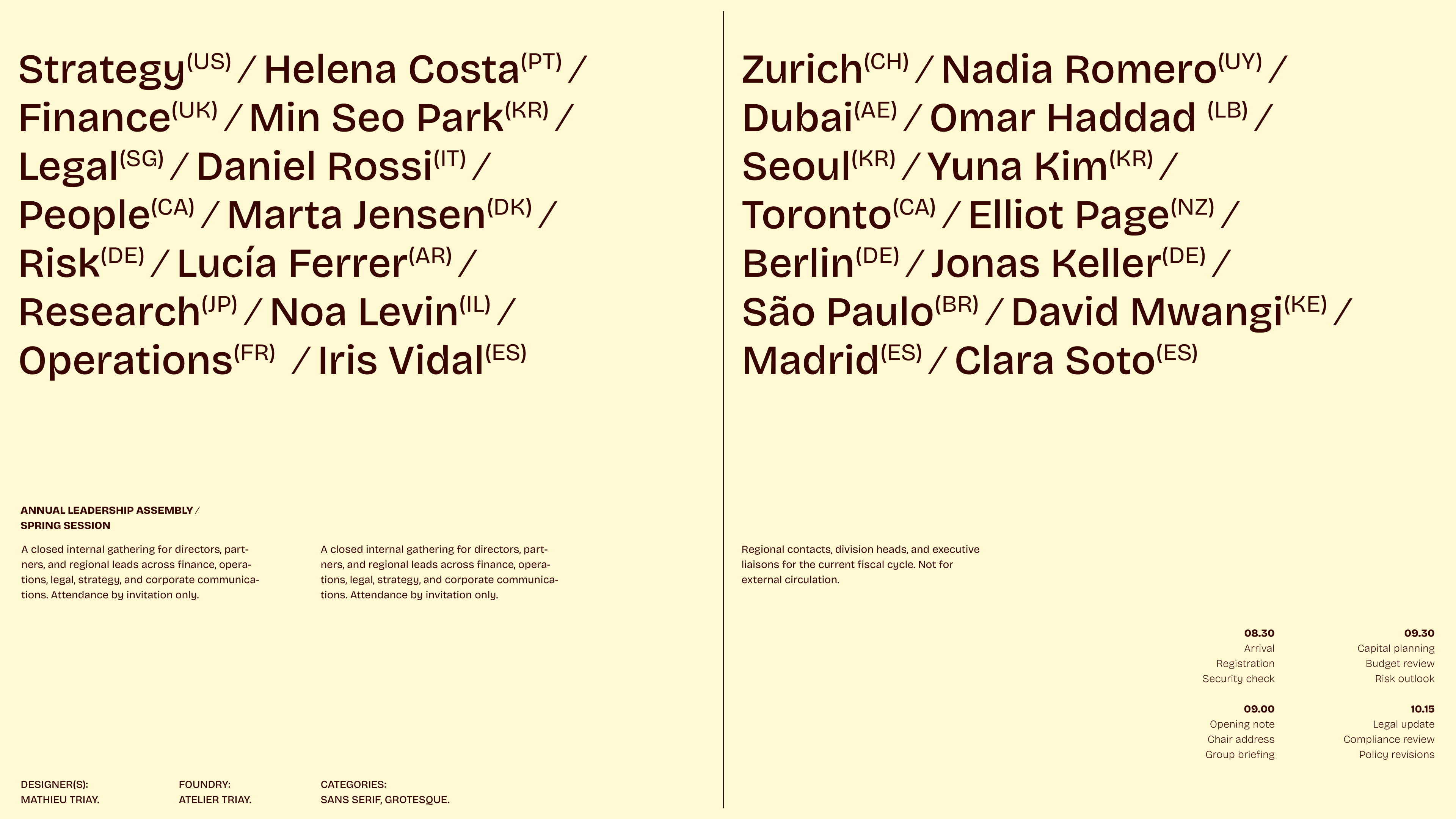
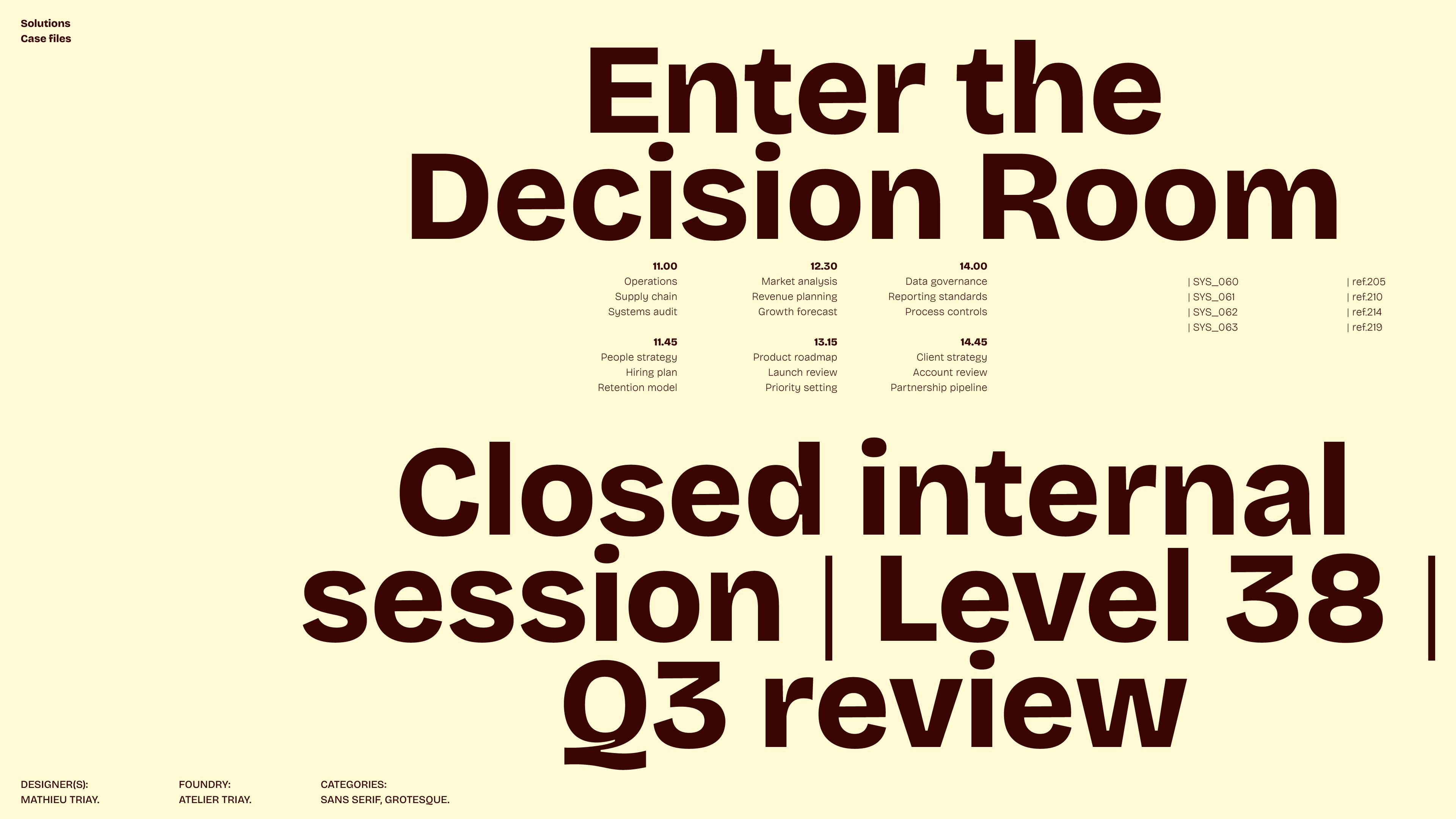
It works well in posters, independent publishing, and editorial projects with a clear visual point of view. It is especially effective in headlines: it helps long titles fit without needing a different font, and gives short ones enough character to avoid feeling flat.
Bricolage Grotesque works best when the typography needs to carry some weight on its own. Its foundations come from an earlier open-source font, reworked and expanded into something with its own identity. That origin shows in the final result: a typeface that feels assembled with intention, not generated from a template. If you need neutral typography, look elsewhere. If you want a sans that holds its own without getting in the way, this one is worth trying.
Share