Sans Serif
Neo Grotesque
Display
Credits & details
Designer(s)
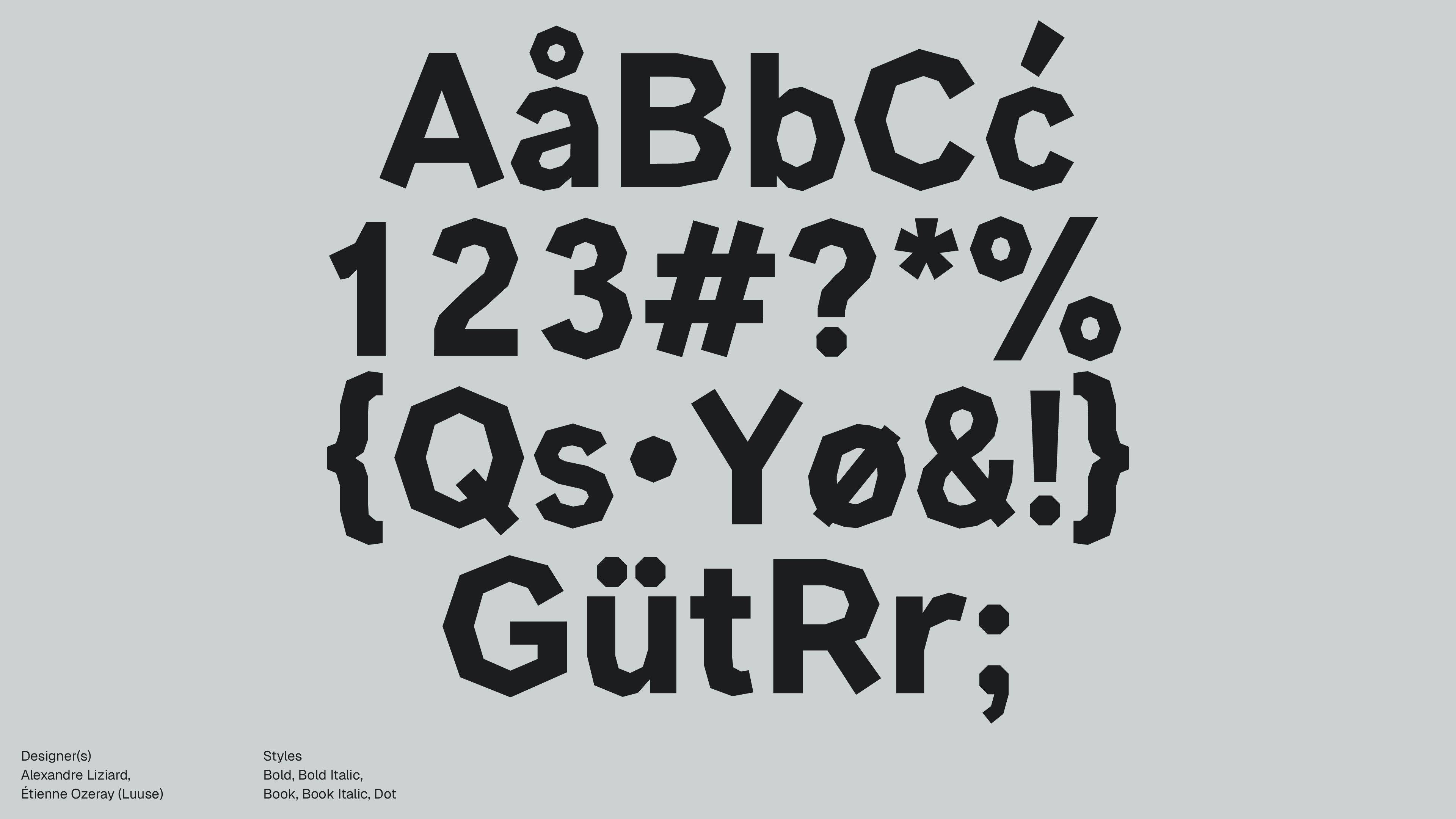
Alexandre Liziard, Étienne Ozeray (Luuse)
FOUNDRY
Luuse
Styles
Bold, Bold Italic, Book, Book Italic, Dot
Available formats
otf, ttf
Designed
2015
Language Support
author
Ale Mottesi
Date
Share


Manifont Grotesk replaces every curve with straight segments. Where most sans-serifs round their letters, this one cuts them into flat, angular planes. You can see how each letter is constructed: the "O" is not a circle but a polygon, and the joins between strokes meet at visible angles instead of blending into each other.

The family includes Book, Bold, and Italic, which is enough to set up a clear hierarchy in headlines and short text blocks. The Dot style does something different: it strips each letter down to a set of spaced points that trace the skeleton of the form. At larger sizes, the points spread out and the letters read more as shapes than as text, which makes it useful for covers, posters, and graphic layouts where the type carries the composition.


For impact, choose Manifont Grotesk. It works best in headlines, posters, zine covers, and title cards. The straight edges stay sharp at large sizes on screen and in print. For body text, use something else and let Manifont Grotesk handle the titles and section openers. It is a small family, but each style has a clear use. See it once, and you can spot it again. That recognizability is the point.
Share