Serif
Display
Credits & details
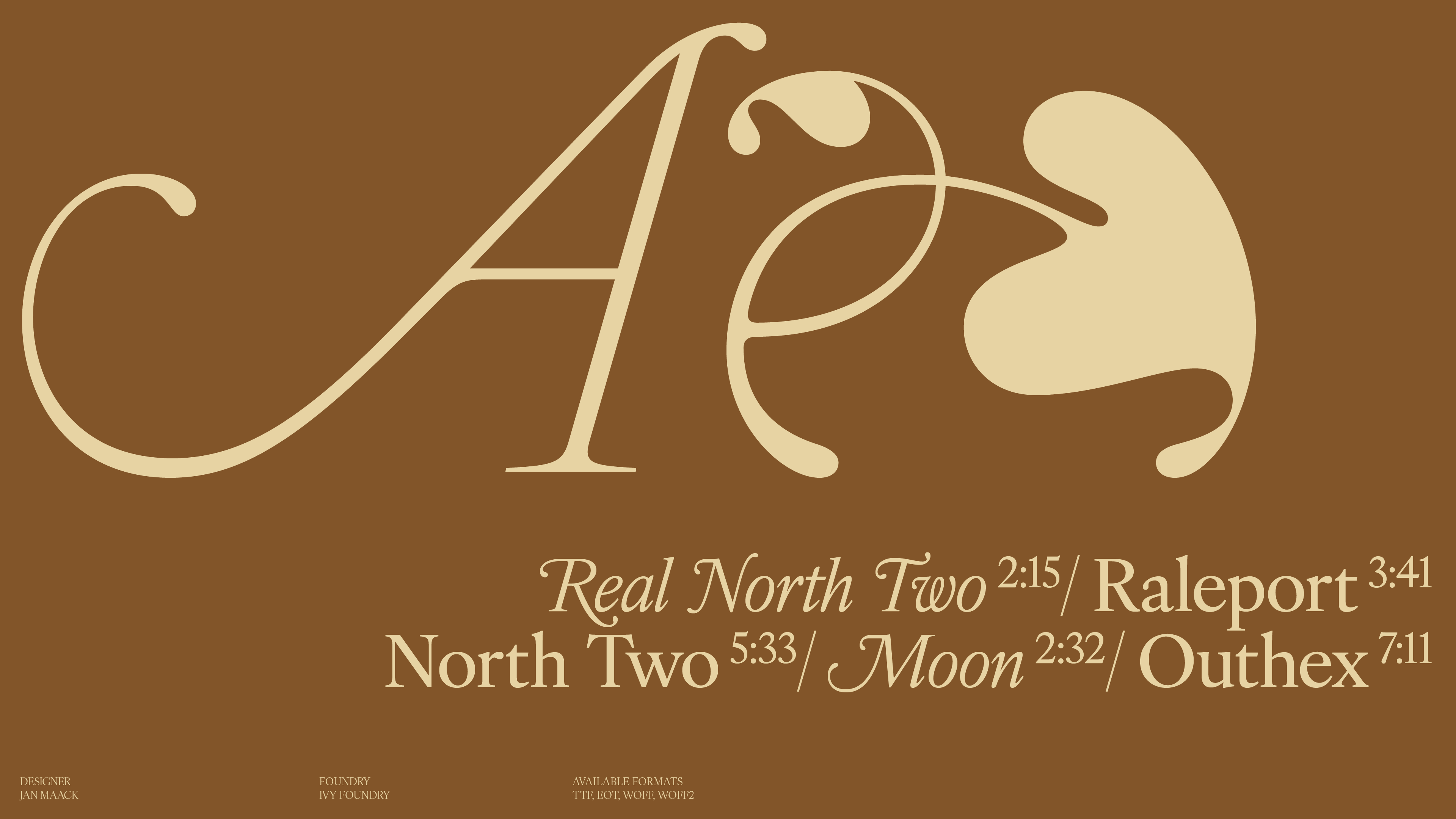
Designer(s)
JAN MAACK
FOUNDRY
IVY FOUNDRY
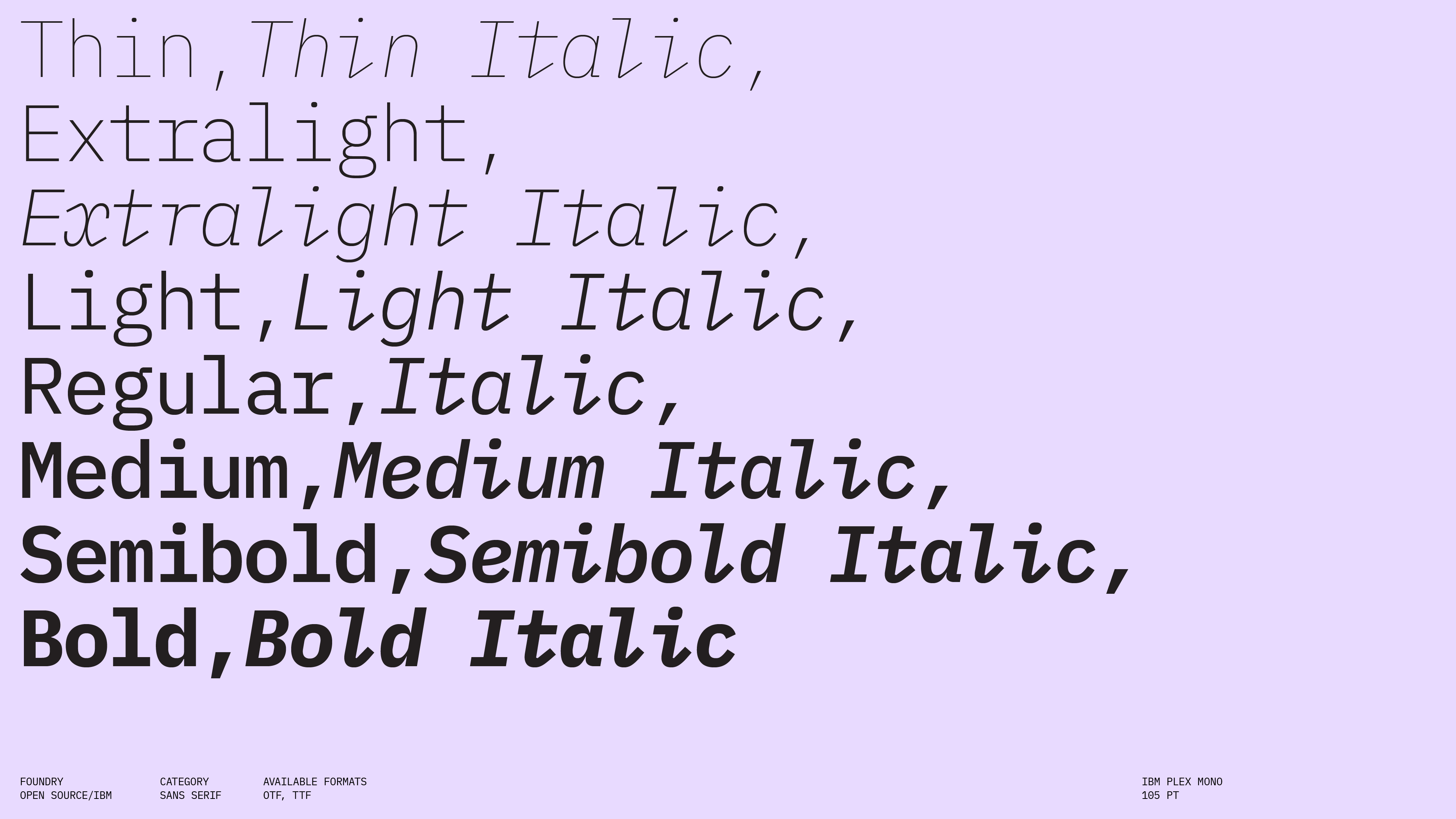
Styles
THIN, THIN ITALIC, LIGHT, LIGHT ITALIC, REGULAR, REGULAR ITALIC, MEDIUM, MEDIUM ITALIC, BOLD, BOLD ITALIC
Available formats
TTF, EOT, WOFF, WOFF2
Designed
2022
Language Support
author
Ale Mottesi
Date
Share


IvyOra, designed by Jan Maack and released through Ivy Foundry, is inspired by 17th-century Dutch serif models, but it feels made for contemporary use. It keeps some of the elegance of those sources while giving the family a cleaner, more controlled structure. The result is a serif that feels refined, readable, and well suited to editorial design.

IvyOra's OpenType features give it the tools for book and magazine work: ligatures, oldstyle figures, fractions, and small caps. That lets designers keep captions, running heads, pull quotes, and footnotes within the same family. The Display styles work well for section openers, covers, and large headlines where some historical character is welcome without becoming decorative. The Thin and Light Display weights are especially effective in spacious layouts where the type itself becomes the main graphic element. Medium and Bold Display weights are better suited to mastheads and stronger title treatments.


In long-form editorial systems, the text styles are built for extended reading: their open shapes and moderate contrast keep multi-page articles and books readable in print and on high-resolution screens. They sit comfortably in essays, interviews, and critical writing where a classical atmosphere is welcome. IvyOra is best suited to designers building editorial systems such as magazines, books, and long-form digital articles, and who want a serif with clear historical roots and enough range to move from body text to more expressive titles within the same family.
Note: IvyOra requires either an Adobe Creative Cloud subscription or a license purchased through Ivy Foundry or Type Network.
Share