Sans Serif
Geometric sans
Credits & details
Designer(s)
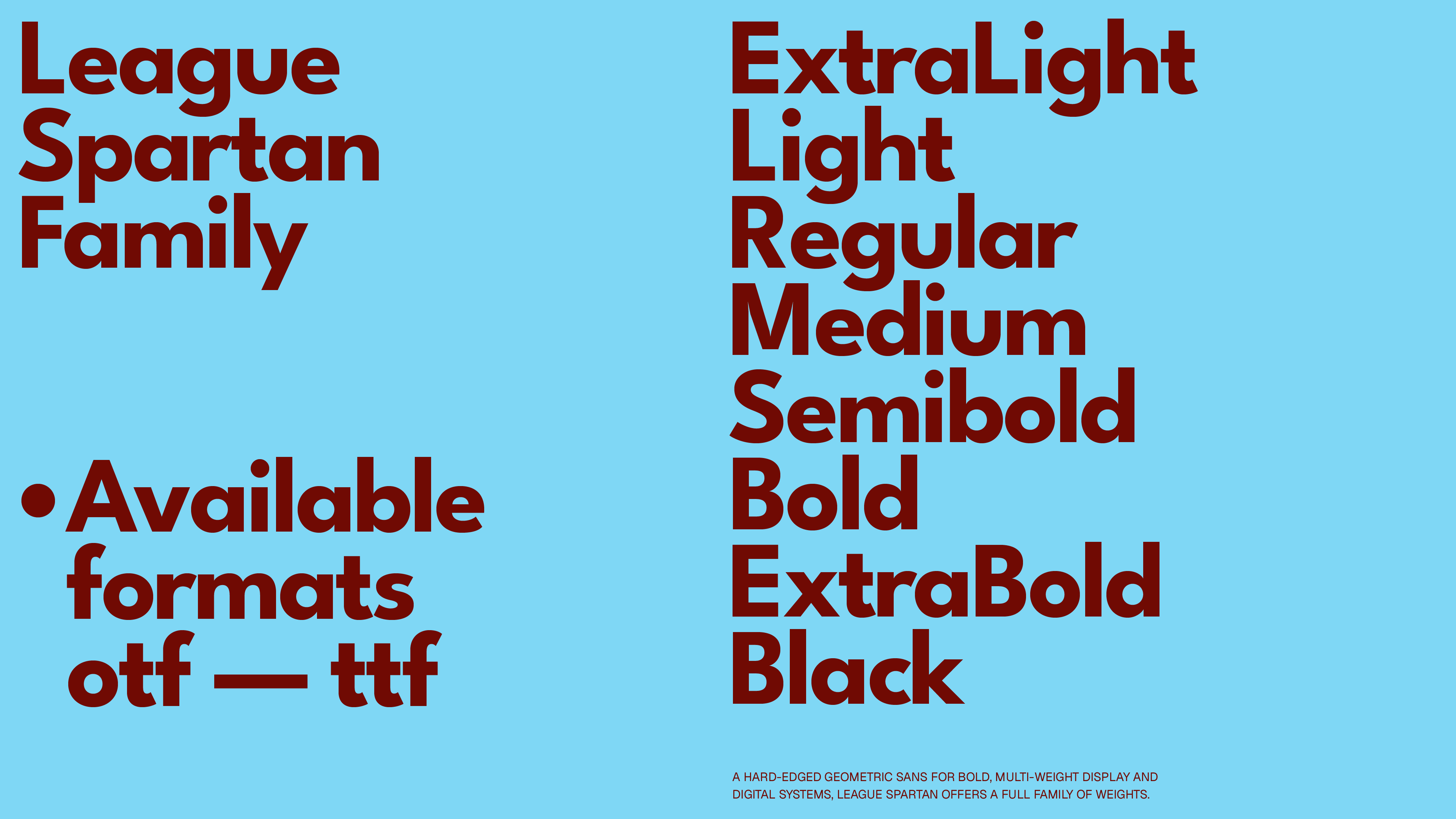
Caroline Hadilaksono, Micah Rich, Tyler Finck, Matt Bailey
FOUNDRY
The League of Moveable Type
Styles
Thin, ExtraLight, Light, Regular, Medium, SemiBold, Bold, ExtraBold, Black
Available formats
otf, ttf
Designed
2014
Language Support
author
Ale Mottesi
Date
Share


League Spartan’s core idea is straightforward: thick circles, straight lines, and generous weight in the darker styles. The capitals are broad, with near-circular “O” and “C” that keep stroke thickness consistent. It offers more than a single bold weight. The current release includes nine weights, from Thin through Black. This range gives designers enough flexibility to build a clear hierarchy: lighter weights for secondary information, middle weights for supporting text, and heavier ones for large headlines.

The character set is also broad for a free family, with wide Latin-language support and a solid range of punctuation and symbols. That matters because it makes multilingual interfaces and editorial layouts easier to set without quickly running into missing characters. Its geometric forms also work well on contemporary screens: in lighter weights, the typeface feels more restrained and works well in supporting roles, while the thinner strokes keep it from taking over the page. In Bold and Black, the voice becomes much stronger, which makes those weights a good fit for branding and digital layouts.
League Spartan is strongest in headlines and logos. The heavier weights work especially well at large sizes on posters, covers, and main titles, where the strong geometry creates immediate impact. It also performs well in motion and title work, where the simple shapes and multiple weights make animation easier to handle.


Geometric sans serifs are a crowded category, but League Spartan earns its place through clean forms, a full range of weights, and an open-source license. Designers, art directors, and students who need a solid geometric sans with straightforward licensing will get real value from it. Use it when you want a confident geometric sans that can move across branding, digital work, and motion while keeping its character.
Share