Typefaces
Sans Serif
Neo Grotesque
Credits & details
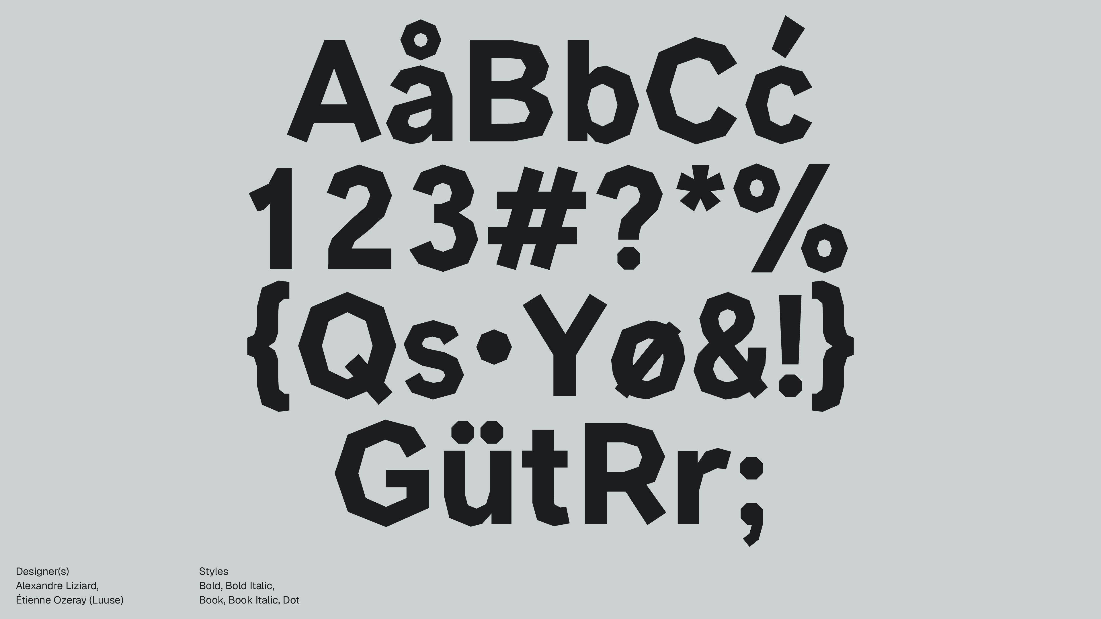
Designer(s)
Mathieu Triay
FOUNDRY
Atelier Triay
Styles
Extra Light, Light, Regular, Medium, Semi Bold, Bold, Extra Bold
Designed
2022
author
Ale Mottesi
Date
Share
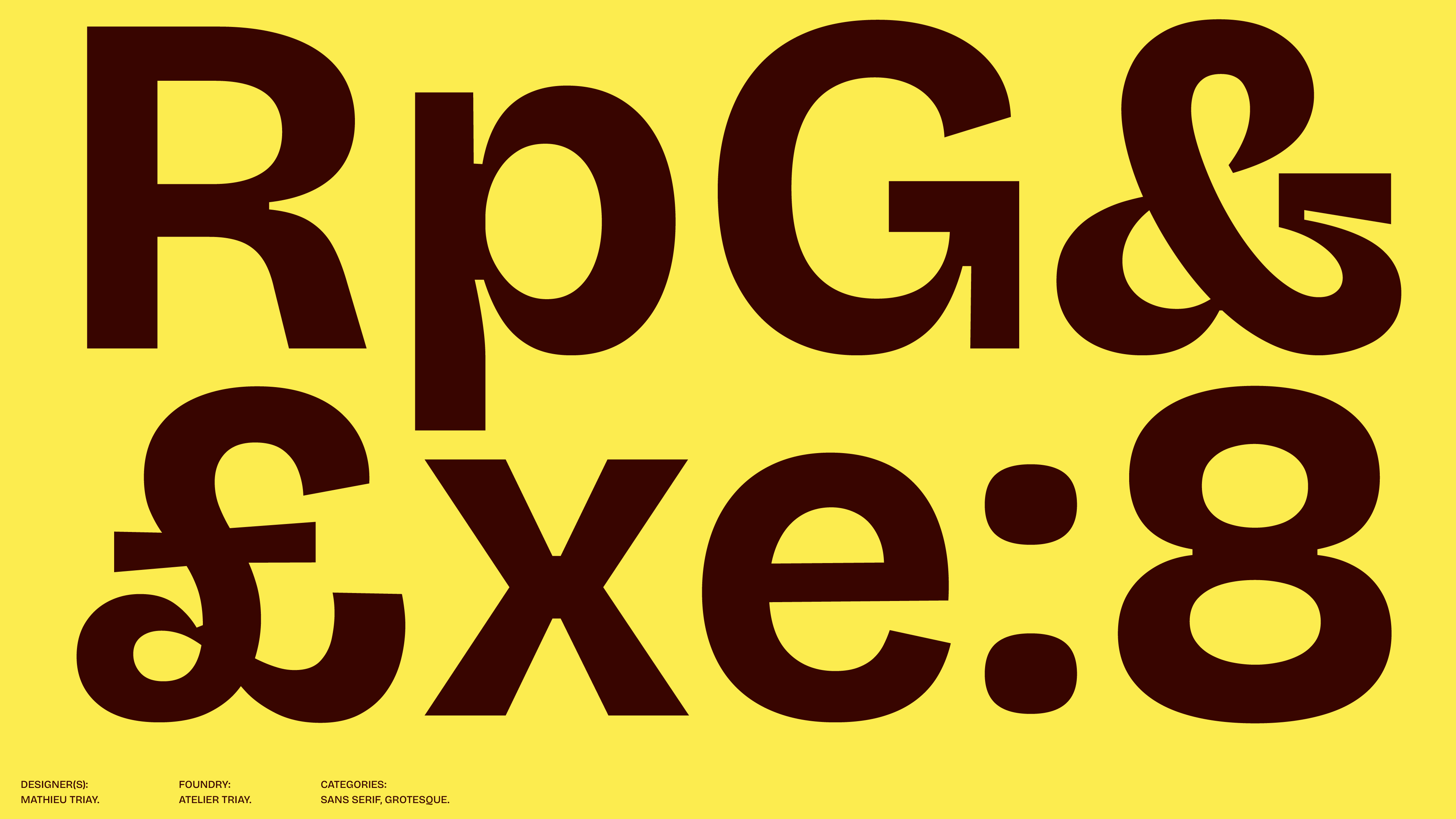
Bricolage Grotesque is not a pure neo-grotesque in the strictest sense, but it leans in that direction. Neo-grotesque sans-serifs are usually more controlled, even, and neutral, with a cleaner and more systematized structure. Bricolage Grotesque shares some of that logic, especially in the way it feels contemporary and usable across uses. At the same time, it does not fully smooth out its personality. Some of its letters still carry the tension, density, and visible character more often associated with older grotesque models.
Designed by Mathieu Triay of Atelier Triay, it is available through Google Fonts. Bricolage Grotesque does not try to look overly smooth or neutral. Many contemporary sans families aim for a calm, polished feel, but this one keeps some tension in the shapes of the letters, especially in its compact forms, firm joins, and the tighter inner spaces of letters like o, p, a, and e.
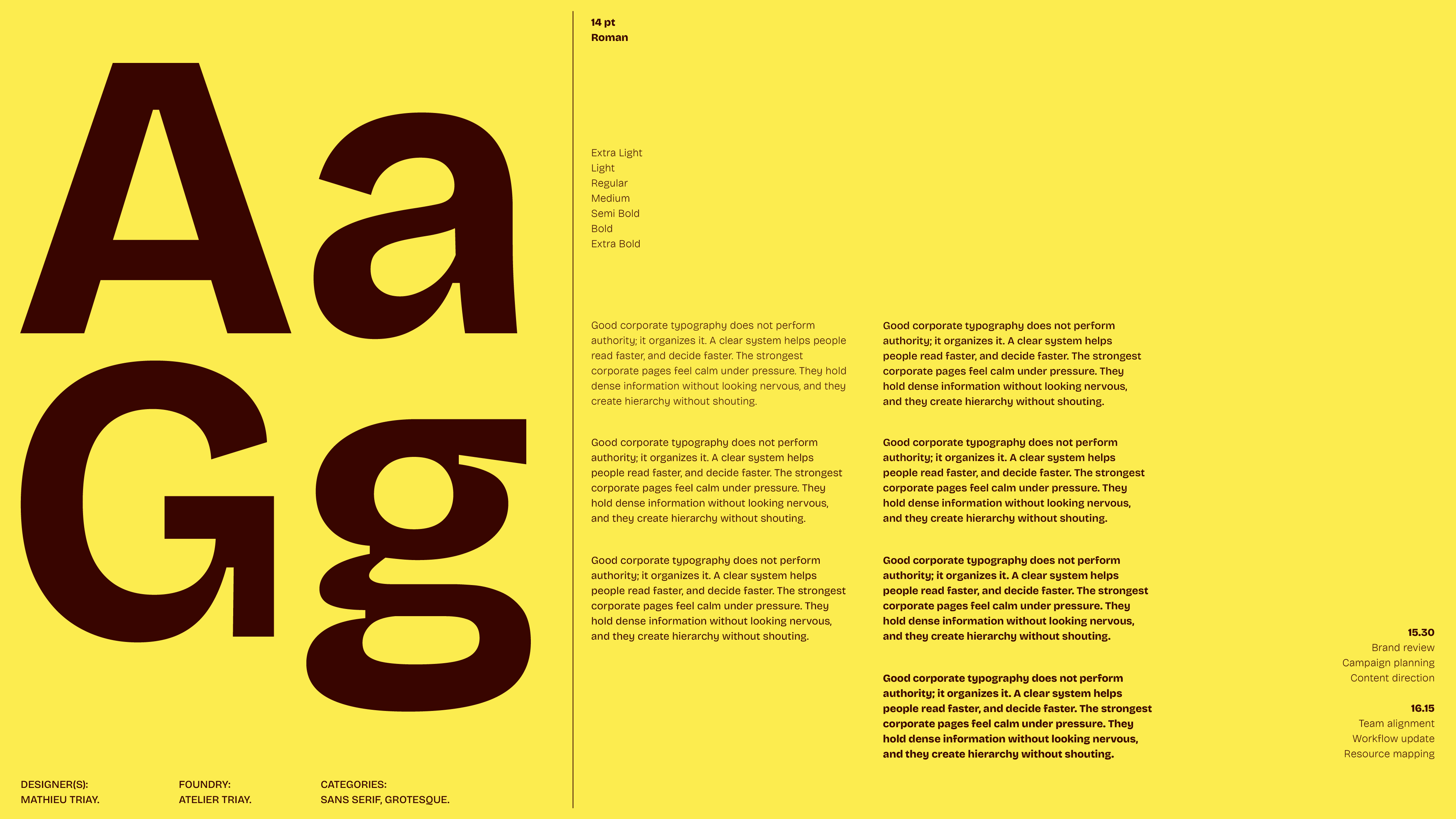
One of its main strengths is that it adjusts to different uses, rather than staying fixed. At large sizes, it can feel sharper and more expressive, while at smaller sizes, it becomes calmer and easier to use. Its proportions and rhythm reinforce that character. The rhythm is not perfectly smooth or even, and that slight unevenness gives the typeface energy and character.
That is why it can feel current without seeming generic. It follows the practical logic of many modern sans-serifs, but avoids the clean, predictable look often seen in contemporary brand systems. It is closer to the kind of typography used in posters, cultural projects, independent publishing, and visual systems with a clear point of view.
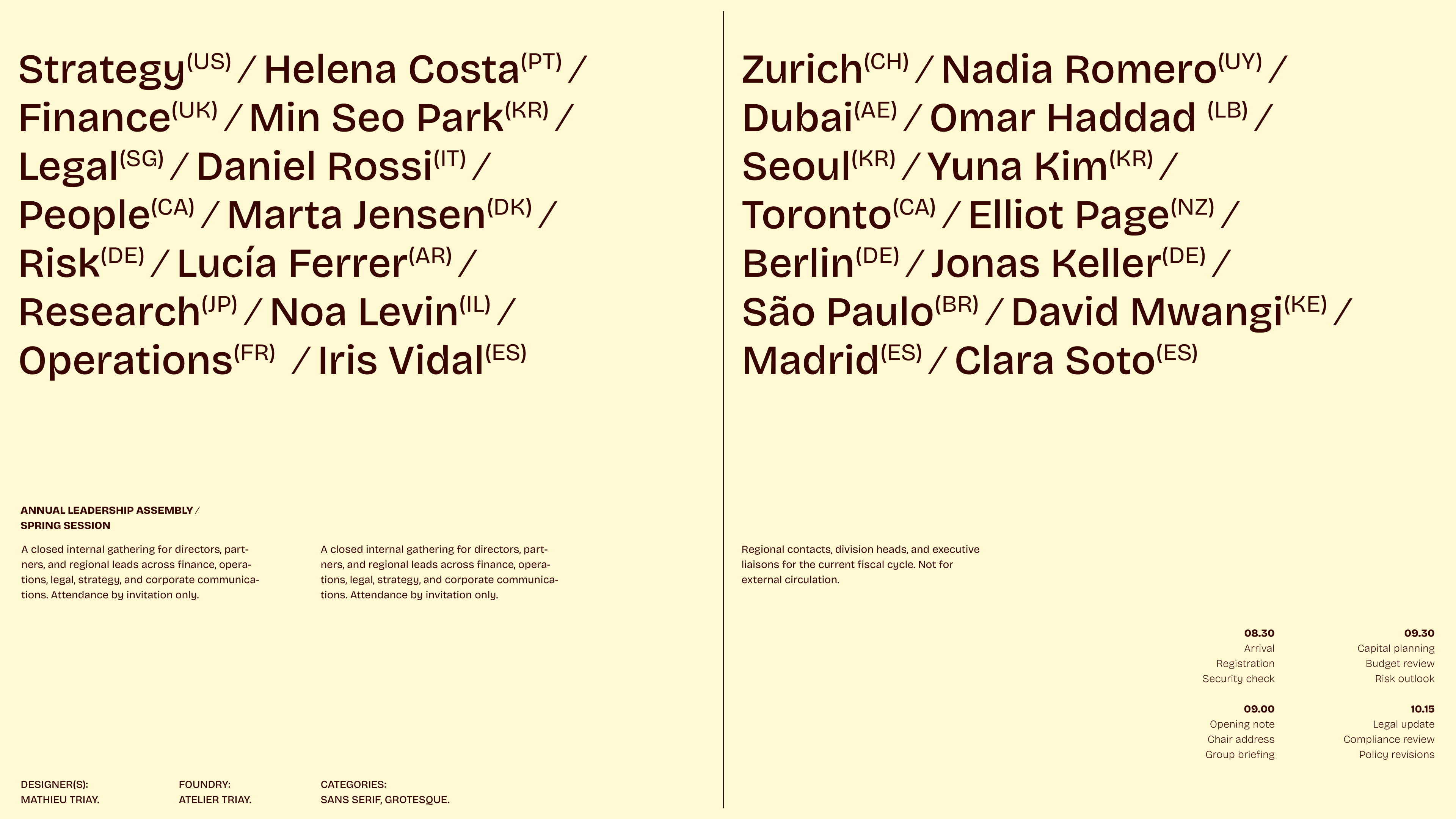
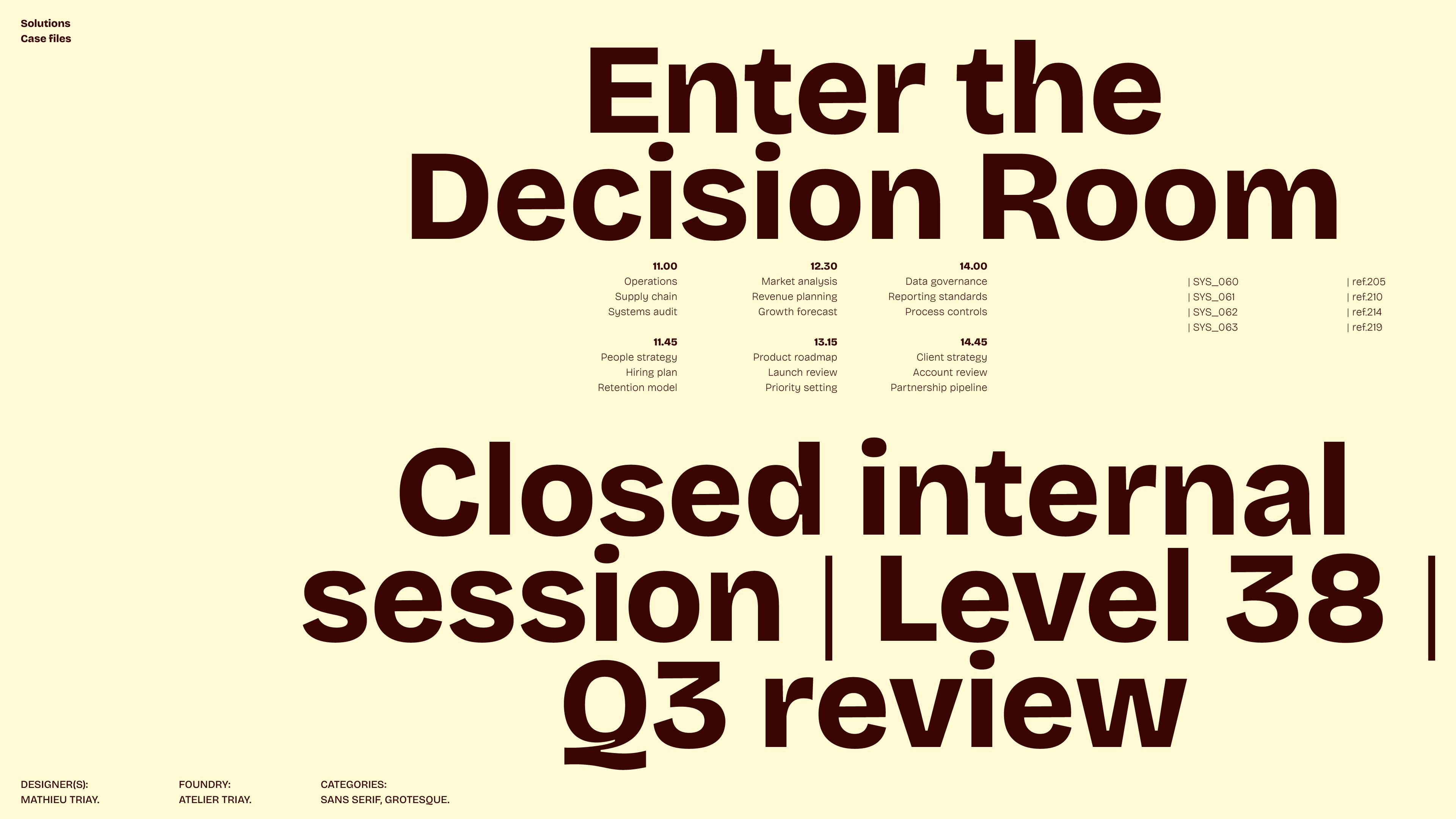
It is especially effective in headlines. It helps long titles fit more easily without needing a different font, and it gives short ones enough character to avoid feeling flat.
Bricolage Grotesque is most useful to designers who need a sans serif with flexibility and personality. Its strengths are its range, its effectiveness in headlines, and the way it stays distinctive without becoming gimmicky. If you need neutral typography, look elsewhere. If you want a sans that stays clear and memorable, this one deserves attention.
Share