Typefaces
Sans Serif
Monospace
Credits & details
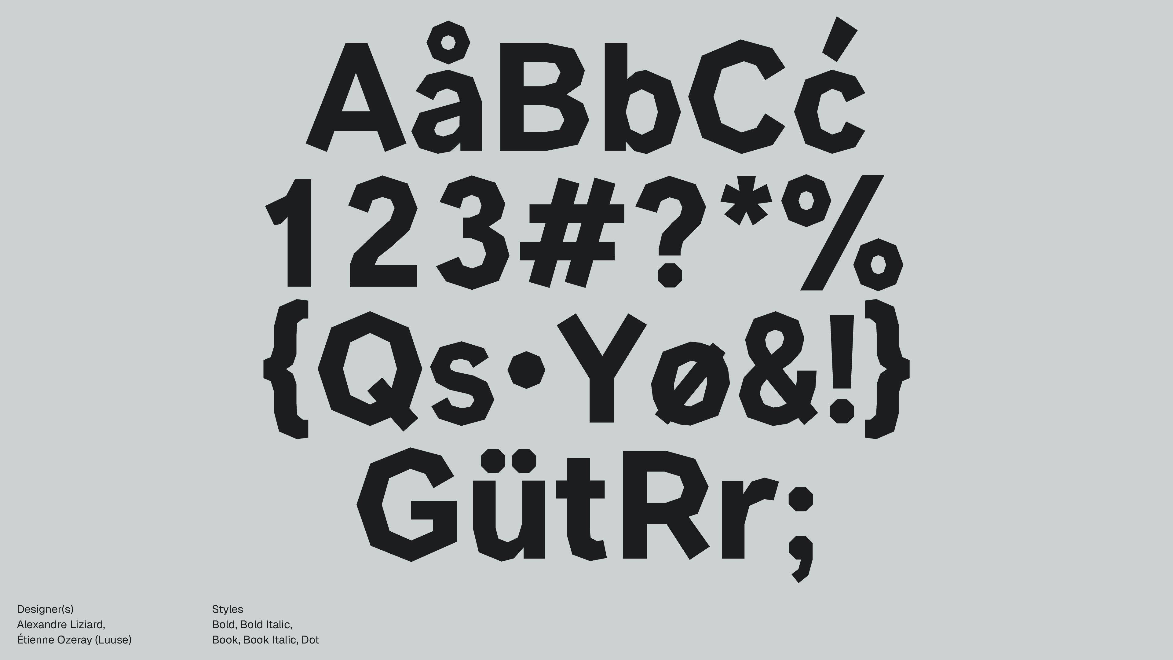
Designer(s)
MIKE ABBINK, PAUL VAN DER LAAN, PIETER VAN ROSMALEN
FOUNDRY
IBM / Bold Monday
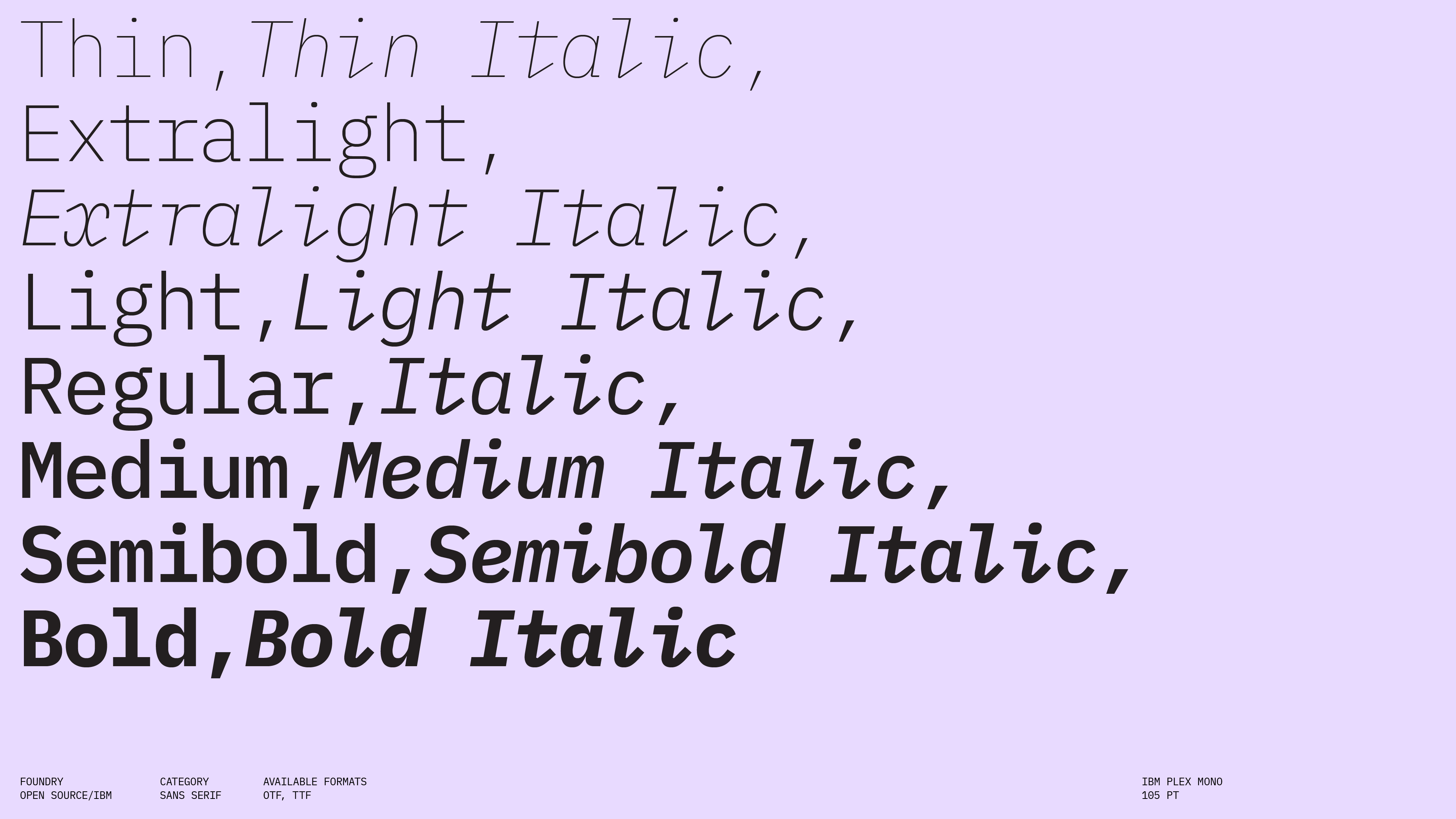
Styles
Thin, Thin Italic, ExtraLight, ExtraLight Italic, Light, Light Italic, Regular, Italic, Medium, Medium Italic, SemiBold, SemiBold Italic, Bold, Bold Italic
Available formats
EOT, OTF, TTF, WOFF, WOFF2
Designed
2017
Language Support
author
Ale Mottesi
Date
Share


IBM Plex Mono is the monospaced member of IBM’s Plex superfamily: a global, open-source code font that shares the same corporate visual logic as Plex Sans and Serif. It aims to feel precise and systematic without becoming cold. The typeface sits at the intersection of branding and utility: a monospaced sans serif designed to express IBM’s visual identity while handling code, command-line interfaces, and data-heavy documents. At its core, Plex Mono is a carefully structured, grid-conscious typeface: every character has the same width, but it avoids the stiff look of many older system monospaces. IBM Plex Mono has a generous style range: Thin, Thin Italic, Extralight, Extralight Italic, Light, Light Italic, Regular, Italic, Text, Text Italic, Medium, Medium Italic, Semibold, Semibold Italic, Bold, Bold Italic. This is unusually deep for a monospaced family: many monospaced code fonts stop at Regular, Italic, Bold, and maybe one extra weight. Beyond the range of styles, Plex is engineered to cover more than 100 languages in a single family, with OpenType features focused on function, including support for basic fractions, currency and math symbols, and script-specific shaping where needed.

This typeface does not chase stylistic alternates and is designed to be a reliable everyday tool. Compared to many developer-focused monospaced fonts that lean into a sci-fi or retro terminal look, Plex Mono feels more like a corporate tool designed to integrate into a brand system rather than steal attention from it. It carries a subtle humanist warmth in its curves and joins, but the overall impression remains controlled and methodical. At small sizes, it reads as straightforward and neutral, ideal for logs, code, and annotations, while at larger sizes subtle quirks appear in the shapes of brackets, braces, and punctuation. The full span from Thin to Bold gives interface designers precise control over hierarchy within code-oriented interfaces, allowing them to reserve stronger weights for highlighted lines, breakpoints, or active tabs without switching families.
IBM Plex Mono also works well in data tables and configuration interfaces, where fixed-width numerals and symbols support precise vertical alignment for IDs, timestamps, and hex values. Paired with Plex Sans, it reinforces the systematic character of the typography without dominating the visual hierarchy. Its value is not that it is the most expressive or the most specialized code font, but that it ties a monospaced style directly into a large, coherent superfamily with broad language support and a clear corporate identity.


Compared to more decorative monospaced designs, Plex Mono is deliberately restrained. It does not attempt expressive, calligraphy-style italics, or experimental proportions, and this restraint is a strength when your priority is consistency across interfaces and documents. For a studio or team building long-lived digital products, Plex Mono is a sensible choice, serving as a serious, coherent work tool that keeps your typography aligned from terminal to keynote slide.
Share