Typefaces
Sans Serif
Neo Grotesque
Credits & details
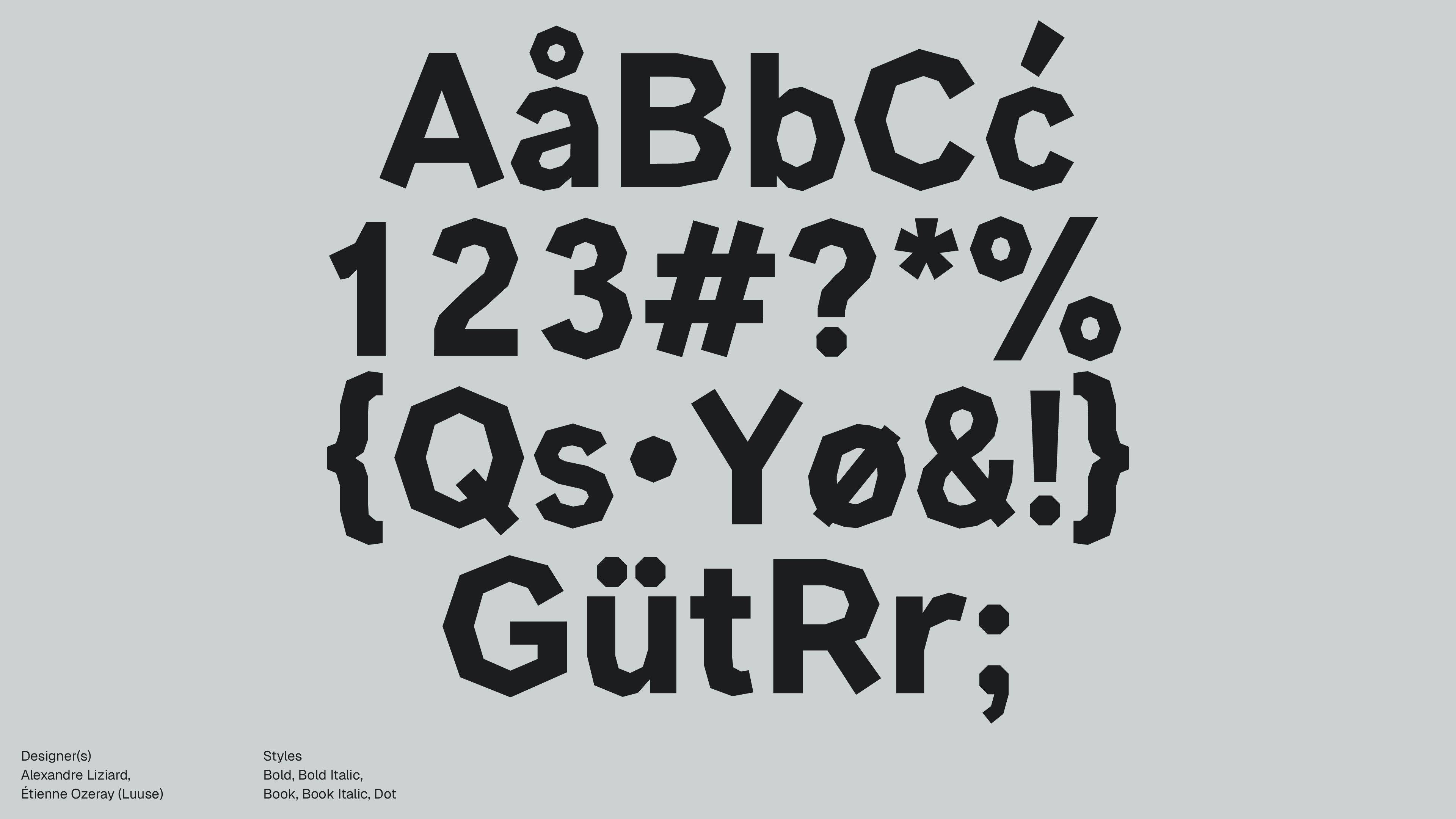
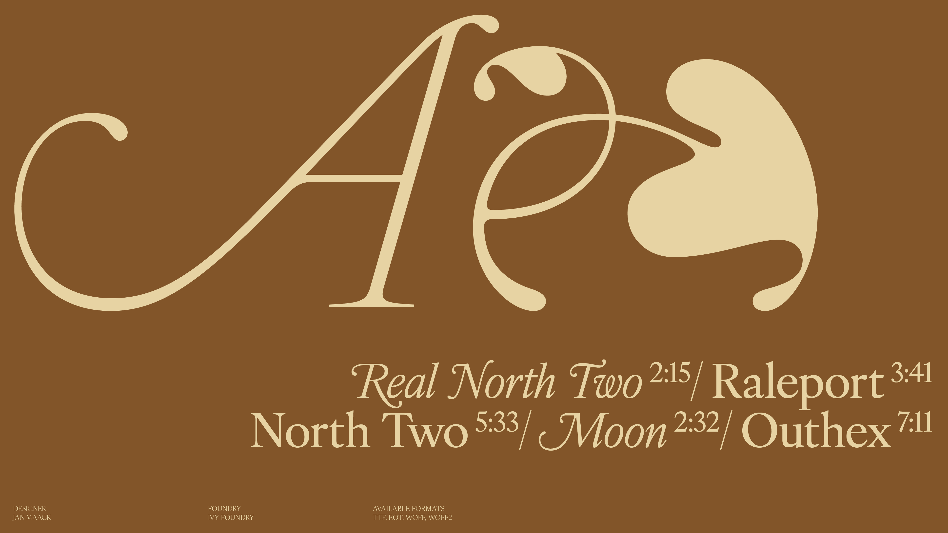
Designer(s)
VERCEL (IN COLLABORATION WITH BASEMENT STUDIO)
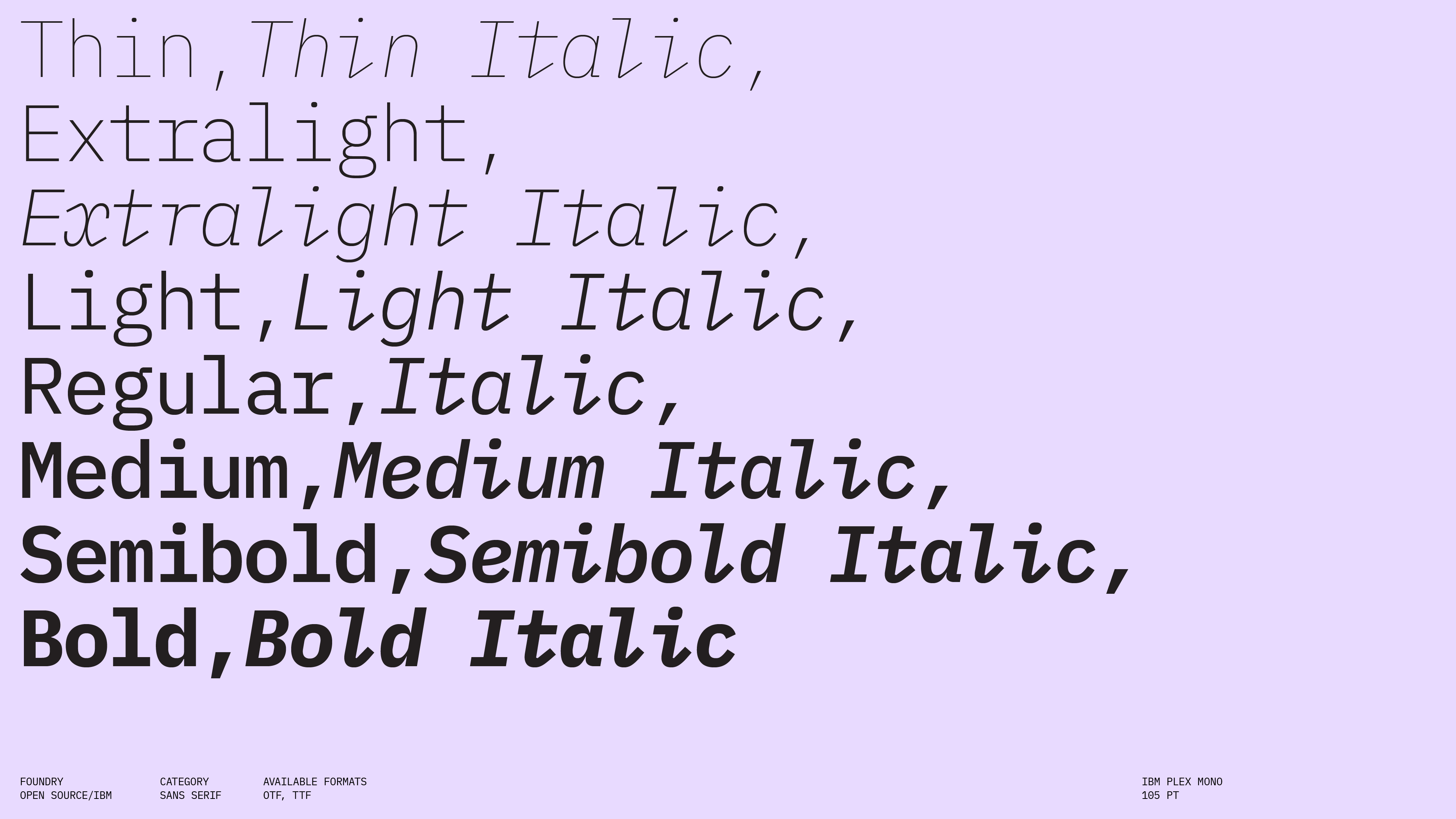
FOUNDRY
VERCEL
Styles
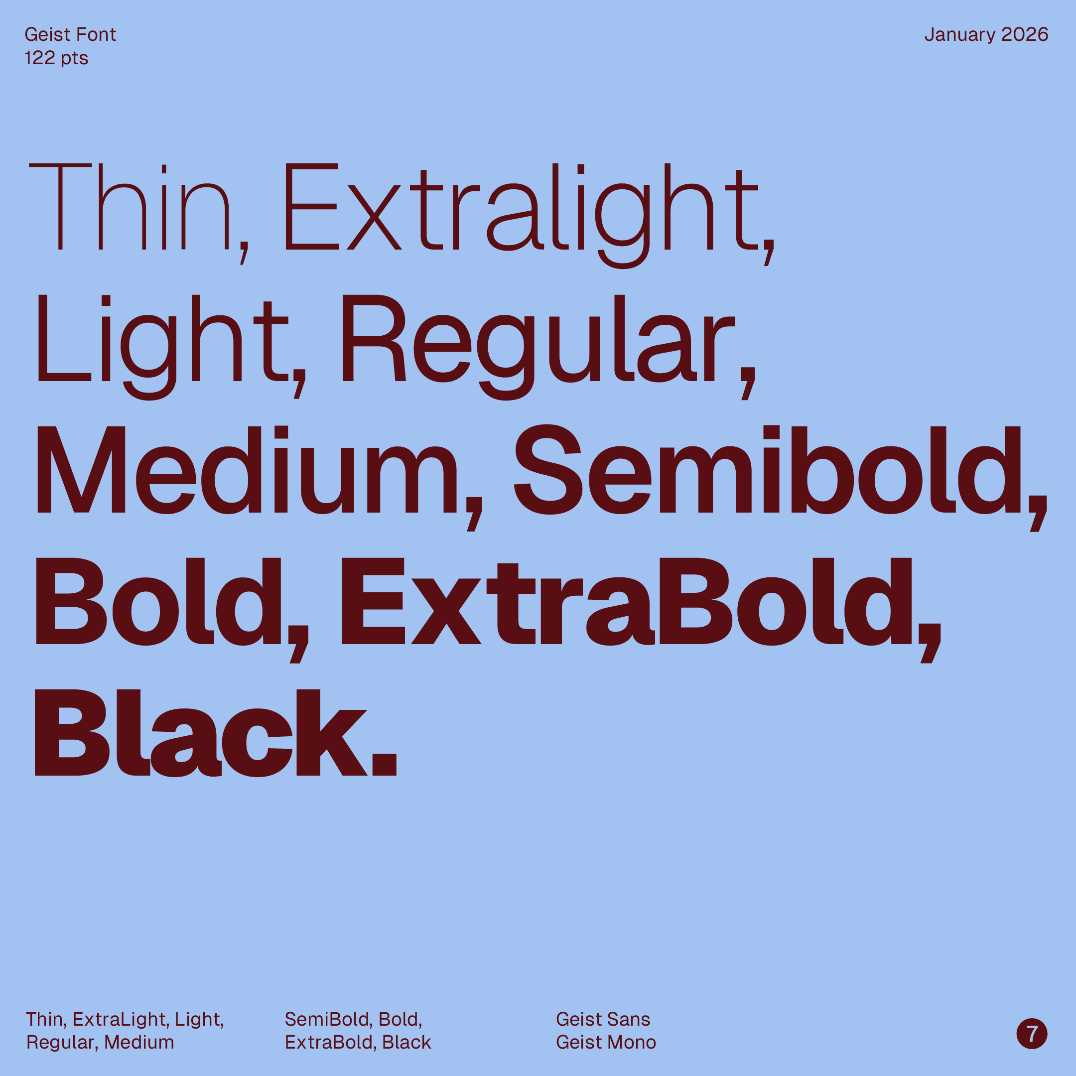
THIN, EXTRALIGHT, LIGHT, REGULAR, MEDIUM, SEMIBOLD, BOLD, EXTRABOLD, BLACK
Available formats
OTF, WOFF2
Designed
2023
Language Support
author
Ale Mottesi
Date
JANUARY 20, 2026
Share


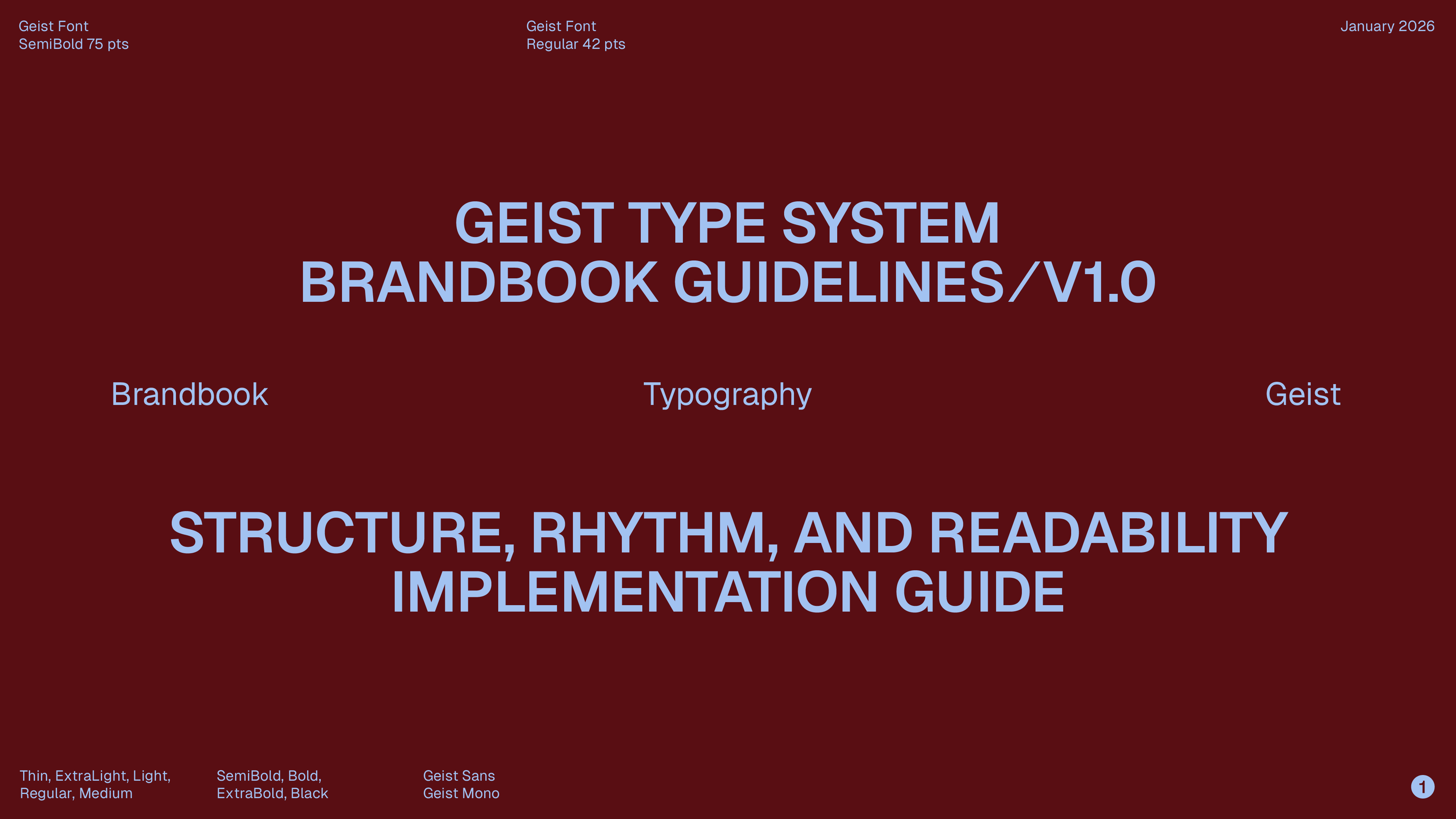
Released by the Vercel team in 2023 in collaboration with Basement Studio, Geist Sans sits firmly in the neo-grotesque tradition: the strokes don’t swing between thick and thin. Weight stays fairly even, which helps text stay stable on screens and at small sizes. The shapes are designed not to call attention to themselves. No quirky terminals, no dramatic flourishes.
A screen-first build that prioritizes legibility and implementation over stylistic signature.
It meets a common need for web developers and product teams: a dependable, all-purpose sans-serif that integrates into modern web and product workflows, including design systems and component libraries.
Geist Sans ships with nine weights (Thin through Black), a substantial glyph inventory, and multiple stylistic sets. The uppercase “R” in Geist Sans stays faithful to the neo-grotesque tradition, with a balanced, restrained construction. The vertical stem is straight and uniform in thickness, while the upper bowl—closed and semicircular—joins the stem at the top with a smooth, continuous curve, without abrupt breaks.

It has enough range to build dense UI hierarchy, sustain long-form technical reading, and scale up to brand-communication headlines without switching families. The lowercase letters are relatively large compared to the capitals. That makes text easier to read at small sizes because the most frequent shapes (a, e, s, n) have clearer interior space. The spacing and letter shapes repeat consistently across words and lines, so even with small type and tighter line spacing, the font holds together—letters don’t collapse, lines don’t feel cramped, and the text stays orderly instead of noisy.
It is released under the SIL Open Font License (OFL), making it broadly usable for personal and commercial projects—an important part of its value proposition for teams optimizing for speed and consistency. It borrows a controlled, system-first attitude from Swiss Style typography: clean structure, consistent spacing, restrained shapes, and a focus on clarity over personality.

Geist Sans is for designers building digital products who need one family for UI labels, body text, and headings, without it looking like it came from different fonts stitched together. The tone, proportions, spacing, and weight progression stay consistent, so hierarchy feels natural. For products where neutrality, speed, and cross-device consistency matter more than typographic self-expression, Geist Sans is the kind of font a team can adopt as a standard system typeface and keep using—built for how digital products are actually made and shipped.
Share