Typefaces
Sans Serif
Credits & details
Designer(s)
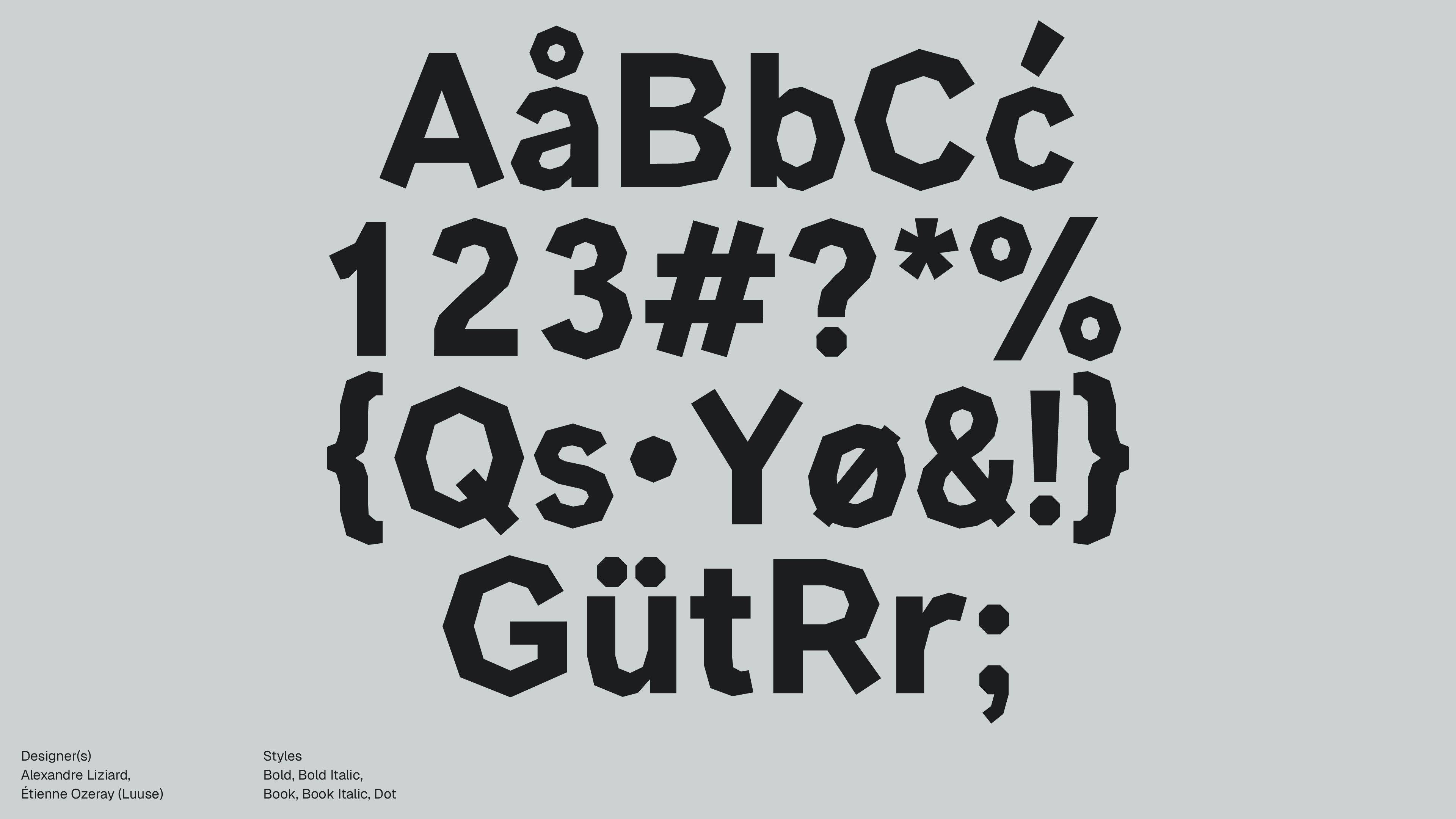
Alexandre Liziard, Étienne Ozeray (Luuse)
Styles
Bold, Bold Italic, Book, Book Italic, Dot
Available formats
otf, ttf
Designed
2015
Language Support
author
Ale Mottesi
Date
Share


Manifont Grotesk takes the neo-grotesk idea and swaps smooth curves for flat planes. The result feels deliberate and disciplined. Set a headline, and you get a clean, chiseled texture that carries weight and remains precise. The forms feel considered, not ornamental.
The rounds are sliced into multi-sided segments, so you can see how the letters are built. It balances clarity with a disciplined mood, reads well in layouts, and supports identity systems, editorial pages, and motion. That mix suits contexts where the structure of the letters is part of the message.

With Book, Bold, and Italic, Manifont Grotesk establishes a clear hierarchy and keeps its planar geometry intact, so large headlines and tight layouts remain readable. The dot version reduces Manifont Grotesk to its nodes, displayed as discrete points that trace each stroke. Curves show up as star-like patterns of dots, stroke ends as tight clusters, and the inner holes as neat rings, so the construction stays visible even without outlines. The result reads as structure first, decoration second.
It shines in display work. Those facets add clear edge definition that reads at a distance and holds up under tight cropping. In short blocks, the typeface creates a consistent rhythm that keeps lines engaging and gives editors a simple way to control reading pace in intros and highlighted quotes. Use it for headline work on posters, zine covers, motion title cards, and brand wordmarks. For longer reading, pair it with something calmer, and let Manifont Grotesk anchor openings and section markers. You will get a cohesive two-type system with roles that don’t compete.


For impact, choose Manifont Grotesk. Its planar facets read fast, hold shape at scale, and stay crisp in print and on screens. See it once, and you can spot it again. That recognizability is the point: a compact, unmistakable signature.
Share