Typefaces
Serif
Credits & details
Designer(s)
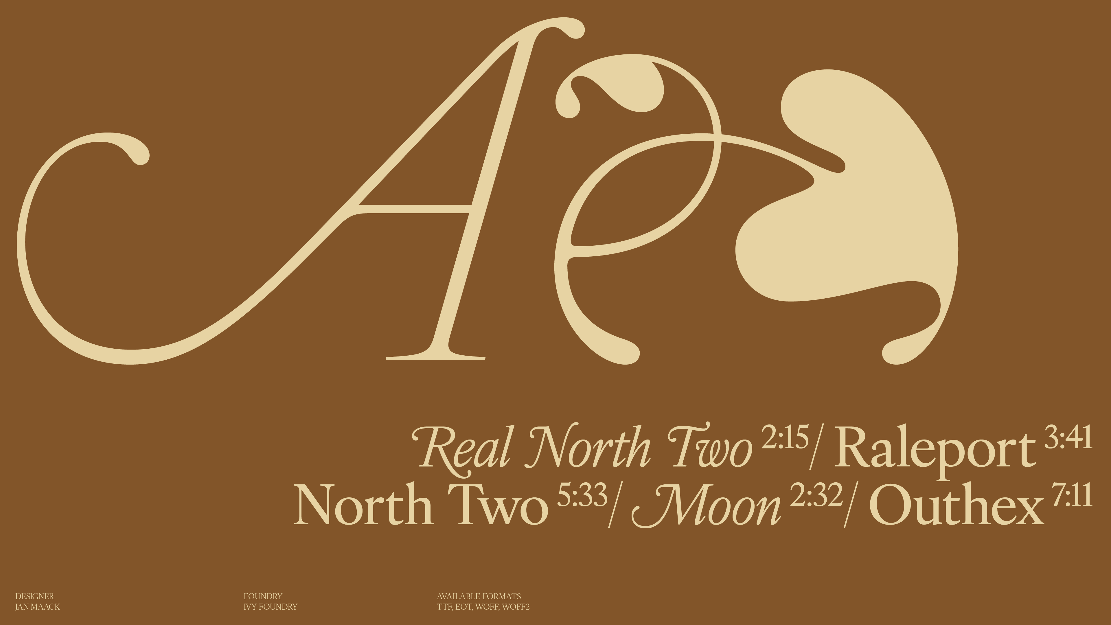
JAN MAACK
FOUNDRY
IVY FOUNDRY
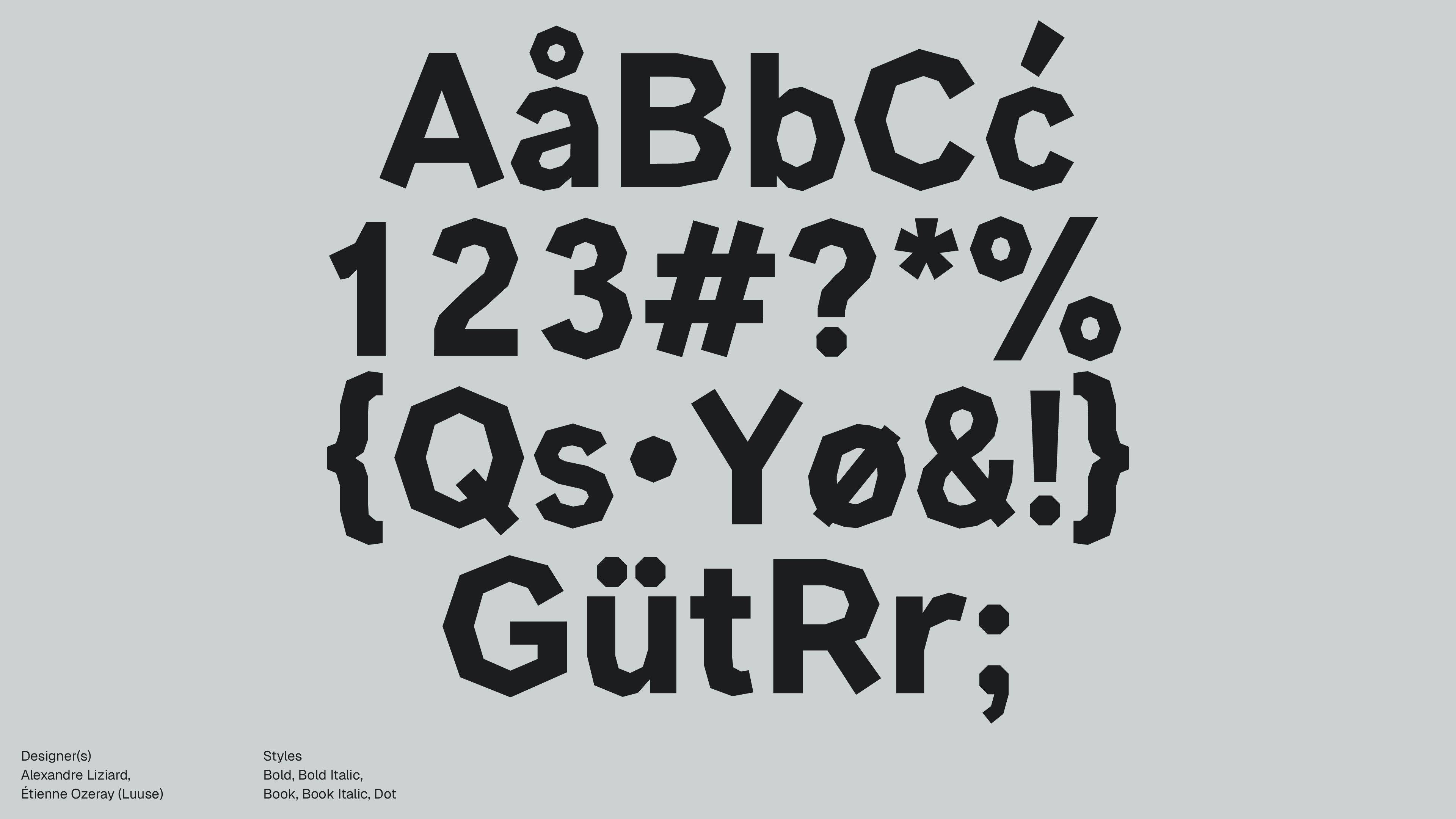
Styles
THIN, THIN ITALIC, LIGHT, LIGHT ITALIC, REGULAR, REGULAR ITALIC, MEDIUM, MEDIUM ITALIC, BOLD, BOLD ITALIC
Available formats
TTF, EOT, WOFF, WOFF2
Designed
2022
Language Support
author
Ale Mottesi
Date
Share


IvyOra, designed by Jan Maack and released through Ivy Foundry, takes 17th-century Dutch Old Face material and rebuilds it as a full superfamily with various weights, italics, and variable fonts. Structurally, it borrows from both Dutch Old Face and transitional models. The Old Face influence gives IvyOra a refined, editorial appearance that recalls the elegance of historical Dutch types, while the transitional influence adds subtle structure and clarity, keeping the contrast delicate and the proportions wide enough to feel more suited to editorial layouts than to strictly grid-based systems.

IvyOra’s OpenType features are designed for serious book and magazine work: ligatures (standard and discretionary), oldstyle figures (numbers with ascenders and descenders that blend with lowercase text), fractions, and small caps. In practice, this gives you the tools to keep everything, from captions and running heads to pull quotes and footnotes, in a single family without resorting to improvised substitutions. The Display styles work well for section openers, magazine covers, and large headlines where you want historical character without resorting to overly decorative styling. The Thin and Light Display cuts in particular can carry large, airy typographic layouts where the type itself is the main graphic element. Medium and Bold Display weights are suited to mastheads and strong wordmarks.


In long-form editorial systems, the Text styles are engineered for immersive reading: open counters and moderate contrast keep multi-page articles and books readable in both print and on high-resolution screens, and they sit comfortably in essays, interviews, and critical writing where you want a classical atmosphere. IvyOra is best suited for designers who regularly build editorial systems—magazines, books, and long-form digital articles—and who want a serif with clear historical roots and enough range to handle everything from running text to expressive titles, so the family can carry an entire publication on its own.
Share