Typefaces
Sans Serif
Credits & details
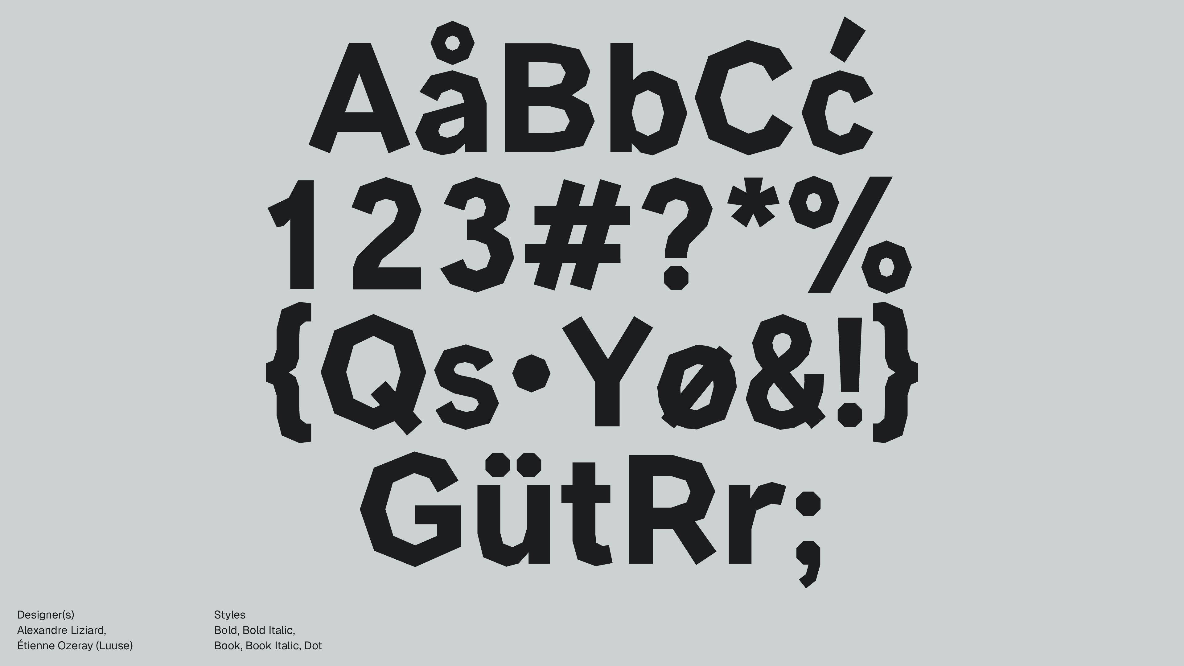
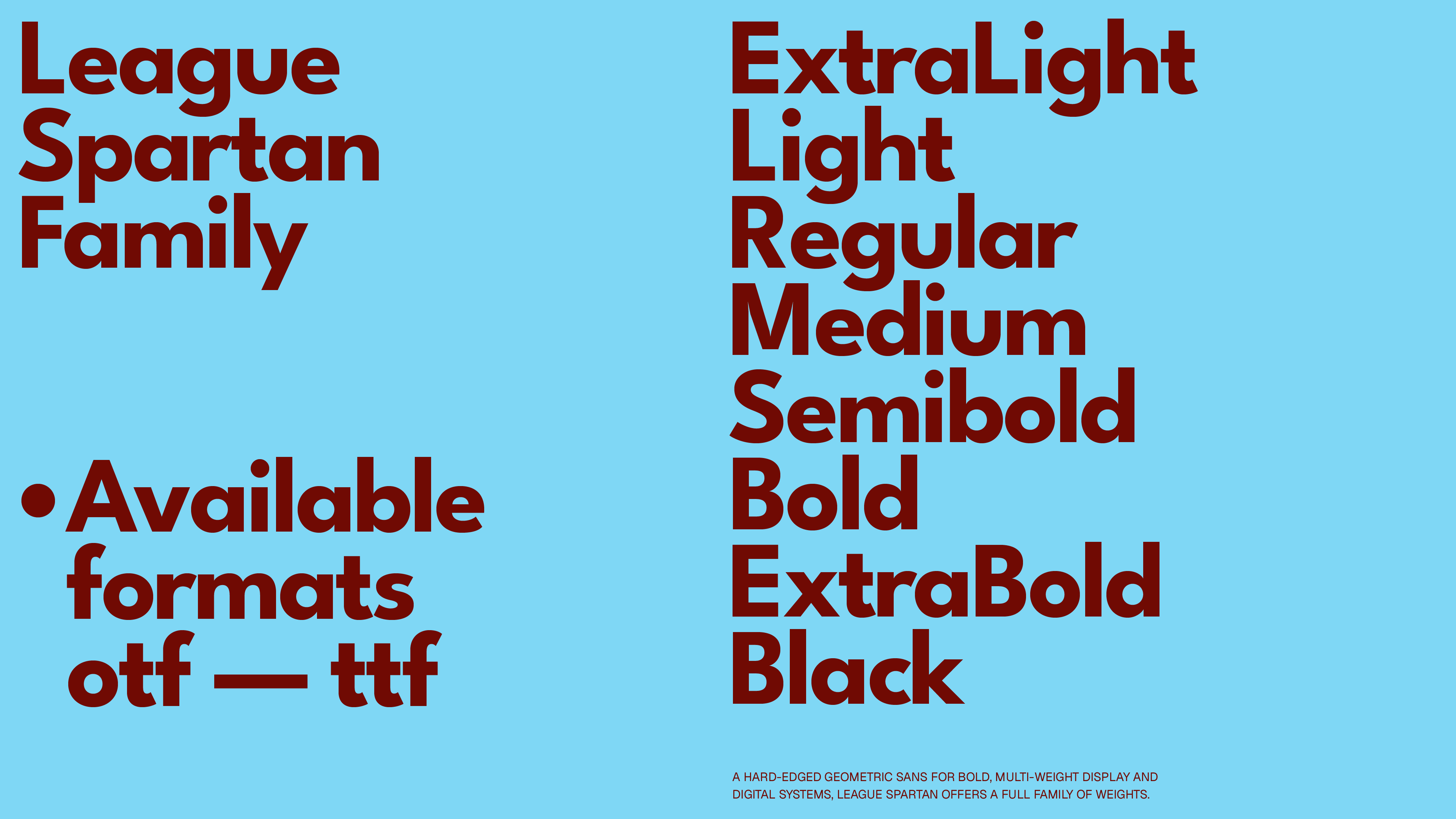
Designer(s)
Caroline Hadilaksono, Micah Rich, Tyler Finck, Matt Bailey
Styles
semiBold, regular, Medium, Light, ExtraLight, ExtraBold, Bold, Black
Available formats
otf, ttf
Designed
2015
Language Support
author
Ale Mottesi
Date
Share


League Spartan’s core idea is straightforward: thick circles, straight lines, and generous weight in the darker styles. The caps are broad and architectural, with near-circular “O” and “C” that keep stroke thickness consistent. The typeface offers more than a single bold weight. The current release provides about eight weights, from ExtraLight through Black. This range gives enough flexibility to build full typographic hierarchies: light weights for secondary information, mid weights for body text, and heavy cuts for hero headlines.

The character set is broad for a free family: different sources list between 300 and 600 glyphs, covering a wide range of Latin-based languages and a solid spread of punctuation and symbols. This matters because you can set multilingual interfaces and editorial layouts without immediately running into missing glyphs. It combines modernist, geometric forms tuned for contemporary screens and interfaces. In lighter weights, the typeface feels calmer and works well in supporting roles. The forms still feel constructed, but the reduction in stroke width on the page keeps them from dominating the layout. In the bold and Black weights, the voice is unmistakably assertive, suited for brand campaigns and landing pages.
League Spartan shines in headlines and wordmarks. The heavier weights thrive at large sizes on posters, covers, and hero sections, where tight rhythm and strong geometry create a quick visual punch. It also works well in motion and title design, where simple shapes, clear counters, and multiple weights make it easy to animate without awkward distortion.


The market is crowded with geometric sans-serifs, but League Spartan’s pitch is clear: a well-drawn, openly licensed take on an established model that holds up in contemporary digital work. Designers, art directors, and students who need a solid geometric display sans with straightforward licensing will get real value from League Spartan. Its main strengths are clean forms, a complete range of weights, and an open-source license that makes it easy to use across branding, digital, and motion work. Use it when you want a confident, modern geometric sans that you can drop into real-world systems.
Share